COVID-19 Cases by Location
This visualization looks at the cases as of 06/04/2020 by location, in the top view shows parameters related to confirmed cases and bottom view shows parameters related to deaths. Both rows show details for geographic location, rise in numbers over time (you can view it on a logarithmic axis as well), total number of cases and top 10 countries. This project allowed me to explore cases and use my visualization skills to understand how the global pandemic is taking shape.
My insights are at this point we don’t look like we have reached the flattened curve which would be required to open up the country. It’s interesting to see how multiple states are opening back up despite the number of overall cases in the US is the highest by a large margin.
Data source: Tableau COVID-19 DataHub
PS: I would highly recommend viewing this dashboard in full-screen either on mobile or desktop. The option for going fullscreen is located in the bottom right corner. If you click on the play button in the upper left you can see a beautiful animation of cases from 1/22/2020

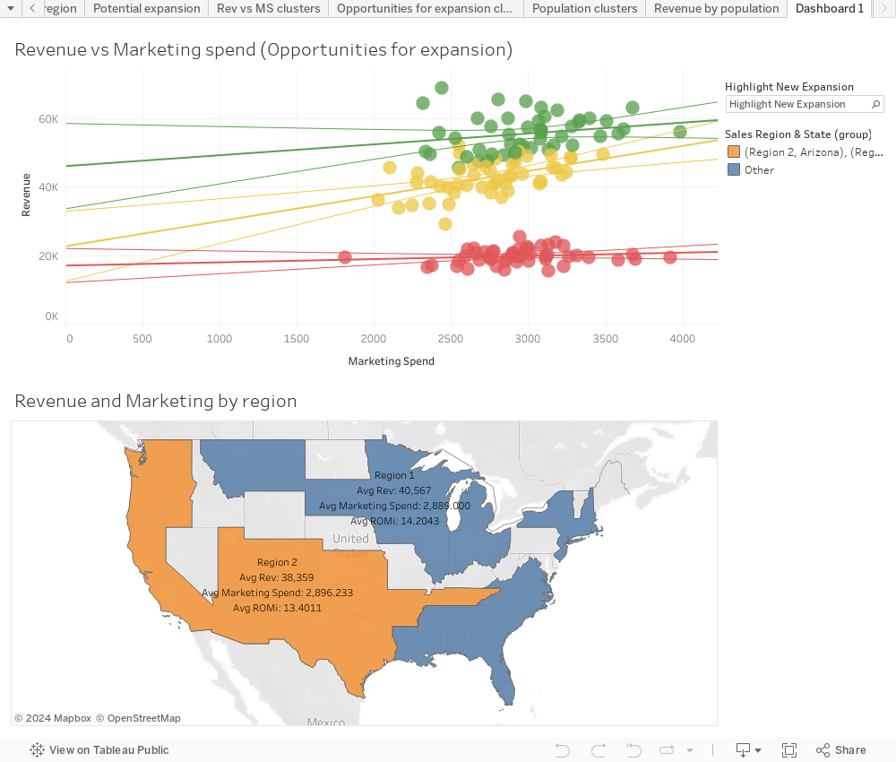
WeWashYouSleep
A laundry startup has regional data for sales in two operating divisions. This dashboard brings together revenue for each area into clusters and identifies the revenue vs. marketing spend with return on marketing investment (ROMI) to help make decisions for expansion of new locations or development of current locations.
Data source: Super Data Science